

By Maria Symeonaki, Associate Professor of Social Statistics, Director of the Social Statistics and Data Analysis Laboratory, Department of Social Policy, Panteion University of Social and Political Sciences
If a picture is worth a thousand words, one could argue that a good infographic is worth a thousand pages. Data visualisation, a new graphic language that is becoming increasingly popular, provides an eye-opening medium of assembling and interpreting datasets, ensuring the best possible outcome for presenting results to the wider audience. Therefore, data visualisation is particularly successful as a means of distilling large amounts of data into digestible pictures. Τhis is the reason why DigiGen uses this technique to present its results and gather important information related to its main axes from different sources in a single webpage.
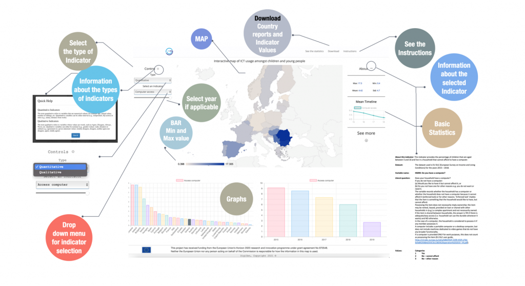
DigiGen’s online interactive map (Picture 1) depicts ICT usage by children and young people across Europe countries, on central aspects such as digital skills, the use of the Internet, online gaming, interest in ICT, digital deprivation percentages, forms of socialisation through digital devices, online civic participation, etc. Moreover, it simultaneously offers infographics with country reports that concern these matters, as well as detailed information about the depicted variables.
More specifically, the map puts together information and derives indicators from well-known and widely used international and European databases (such as the OECD’s Programme for International Student Assessment (PISA), the European Union Statistics on Income and Living Conditions (EU SILC), the European Social Survey (ESS), the International Computer and Information Literacy Study (ICILS) and the Trends in International Mathematics and Science Study (TIMSS)) and it will be updated as more evidence becomes available, including results from DigiGen’s own research.
The idea behind the map is to develop a user-friendly tool that will help the interested audience and the wider scientific community (researchers, policymakers, teachers, families, etc) get a clear picture and an easy way to envisage the divergencies and convergencies amongst European countries in ICT usage by children and young people.
Selecting an indicator leads to an automated development of a map, where all European countries are classified based on the values of the selected indicator. Some basic descriptive statistics and graphs are furthermore presented for the selected indicator for a clearer presentation and visualisation of the data. Information about the indicator is also available to help users understand what is being measured through the selected indicator. Instructions for using the map and for accessing raw data from the sample surveys that were used to estimate the indicators are also available.
Apart from the selected indicator’s values, the developed map and the statistical descriptions, a number of files are available to users for download, i.e., infographics with country reports (in pdf format and customised) and the values for the selected indicator as Excel files. The user can customise the country reports according to their needs and they are also able to download an Excel file with the values of the indicator and the number of valid cases used to estimate it.
In conclusion, the map aims to serve as a major source of information for those interested in the use of digital technologies by children and young people.